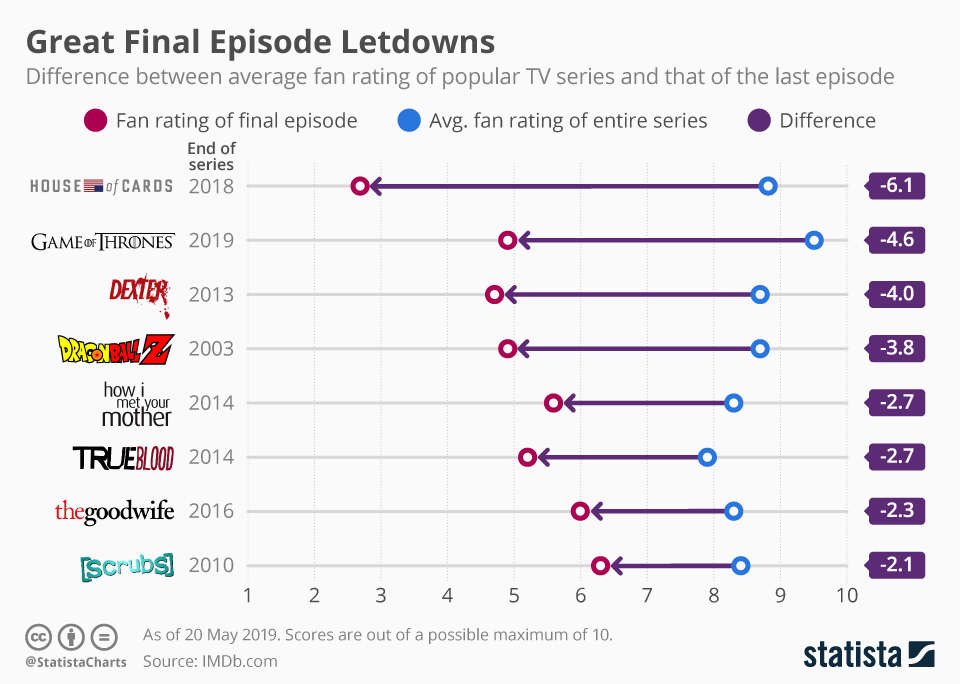
Game of Thrones has come to an end. After 8 seasons and 73 episodes, the finale of HBO's celebrated series was broadcast on Sunday night. But while overall the series was extremely well-received, boasting an average fan rating of 9.5 out of 10 on IMDb, the concluding episode so far has the worst rating in the series - 4.9 out of 10. As our infographic shows, when comparing to the series' average rating, the ending to Game of Thrones represents one of the biggest let downs of all time.
Ahead of the events in the Seven Kingdoms in this respect though is House of Cards. Here, the average rating for the series is 8.8 but the last episode has a terrible 2.7 stamped across it. Rounding off the top three of our selection, Dexter disappointed fans to the tune of 4.7 - a whole 4.0 less than the average 8.7 viewers had become accustomed to.
Great Final Episode Letdowns
Entertainment

Description
This chart shows TV series with large differences between the average fan rating of the entire series and that of the last episode.


